CupertinoTextField
An iOS-style text field.
A text field lets the user enter text, either with hardware keyboard or with an onscreen keyboard.
Examples
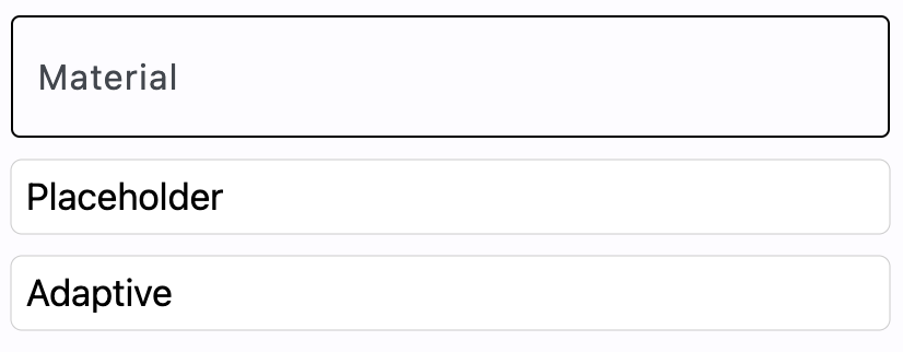
Basic textfields
- Python
import flet as ft

def main(page: ft.Page):

    page.add(
        ft.TextField(
            label="Material",
        ),
        ft.CupertinoTextField(
            placeholder_text="Placeholder",
        ),
        ft.TextField(
            adaptive=True,
            label="Adaptive",
        ),
    )


ft.app(target=main)

Properties
autocorrect
Whether to enable autocorrection. Default is True.
autofocus
True if the control will be selected as the initial focus. If there is more than one control on a page with autofocus set, then the first one added to the page will get focus.
bgcolor
TextField background color.
blend_mode
The blend mode applied to the color or gradient background. Property value is BlendMode enum with MODULATE as default.
border
A border to draw around input.
The value is an instance of border.Border class.
border_color
Border color. Could be transparent to hide the border.
border_radius
Border radius is an instance of border_radius.BorderRadius class.
can_reveal_password
Displays a toggle icon button that allows revealing the entered password. Is shown if both password and can_reveal_password are True.
The icon is displayed in the same location as suffix and in case both can_reveal_password/password and suffix are provided, then the suffix is not shown.
capitalization
Enables automatic on-the-fly capitalization of entered text.
Property value is TextCapitalization enum.
Default is NONE.
clear_button_semantics_label
The semantic label for the clear button used by screen readers. This will be used by screen reading software to identify the clear button widget. Defaults to "Clear".
color
Text color.
content_padding
The padding for the input decoration's container.
The value is an instance of padding.Padding class or a number.
cursor_color
The color of TextField cursor.
cursor_height
Sets cursor height.
cursor_radius
Sets cursor radius.
cursor_width
Sets cursor width.
dense
Whether the TextField is part of a dense form (ie, uses less vertical space).
enable_suggestions
Whether to show input suggestions as the user types.
This flag only affects Android. On iOS, suggestions are tied directly to autocorrect, so that suggestions are only shown when autocorrect is True. On Android autocorrection and suggestion are controlled separately. Default is True.
filled
If True the decoration's container is filled with theme fillColor.
focused_bgcolor
Background color of TextField in focused state.
focused_border_color
Border color in focused state.
focused_border_width
Border width in focused state.
focused_color
Text color when TextField is focused.
gradient
Configures gradient background. The value must be an instance of one of the following classes:
input_filter
Provides as-you-type filtering/validation in your TextField.
The value is an instance of the InputFilter class.
keyboard_type
The type of keyboard to use for editing the text. The property value is KeyboardType enum.
The default is TEXT.
max_length
Limits a maximum number of characters that can be entered into CupertinoTextField.
max_lines
The maximum number of lines to show at one time, wrapping if necessary.
This affects the height of the field itself and does not limit the number of lines that can be entered into the field.
If this is 1 (the default), the text will not wrap, but will scroll horizontally instead.
min_lines
The minimum number of lines to occupy when the content spans fewer lines.
This affects the height of the field itself and does not limit the number of lines that can be entered into the field.
Default is 1.
multiline
True if TextField can contain multiple lines of text.
password
Whether to hide the text being edited. Default is False.
placeholder_text
A lighter colored placeholder hint that appears on the first line of the text field when the text entry is empty. Defaults to an empty string.
placeholder_style
The TextStyle to use for placeholder_text.
prefix
Optional Control to place on the line before the input.
prefix_mode
Defines the visibility of the prefix control based on the state of text entry. Has no effect if prefix is not specified.
The property value is VisibilityMode enum.
The default is ALWAYS.
read_only
Whether the text can be changed.
When this is set to True, the text cannot be modified by any shortcut or keyboard operation. The text is still selectable.
Defaults to False.
rtl
True to set text direction to right-to-left. Default is False.
selection_color
The color of TextField selection.
shadow
A list of shadows behind the text field.
shift_enter
Changes the behavior of Enter button in multiline TextField to be chat-like, i.e. new line can be added with Shift+Enter and pressing just Enter fires on_submit event.
show_cursor
Whether the field's cursor is to be shown. Defaults to True.
smart_dashes_type
Whether to allow the platform to automatically format dashes.
This flag only affects iOS versions 11 and above. As an example of what this does, two consecutive hyphen characters will be automatically replaced with one en dash, and three consecutive hyphens will become one em dash. Default is True.
smart_quotes_type
Whether to allow the platform to automatically format quotes.
This flag only affects iOS. As an example of what this does, a standard vertical double quote character will be automatically replaced by a left or right double quote depending on its position in a word. Default is True.
suffix
Optional Control to place on the line after the input.
suffix_mode
Defines the visibility of the suffix control based on the state of text entry. Has no effect if suffix is not specified.
The property value is VisibilityMode enum.
The default is ALWAYS.
text_align
How the text should be aligned horizontally.
Property value is TextAlign enum.
The default is LEFT.
text_size
Text size in virtual pixels.
text_vertical_align
Defines how the text should be aligned vertically. It's value can either be a number ranging from -1.0 (topmost location) to 1.0 (bottommost location) or of type VerticalAlignment enum.
The default is CENTER.
text_style
The TextStyle to use for the text being edited.
value
Current value of the TextField.
Methods
focus()
Moves focus to a TextField.
Events
on_blur
Fires when the control has lost focus.
on_change
Fires when the typed input for the TextField has changed.
on_focus
Fires when the control has received focus.
on_submit
Fires when user presses ENTER while focus is on TextField.