
File picker and uploads

ยท 4 min read
Feodor Fitsner
Flet founder and developer

Finally, File picker with uploads has arrived! ๐ŸŽ‰

File picker control opens a native OS dialog for selecting files and directories. It's based on a fantastic file_picker Flutter package.

It works on all platforms: Web, macOS, Window, Linux, iOS and Android.

Check out source code of the demo above.

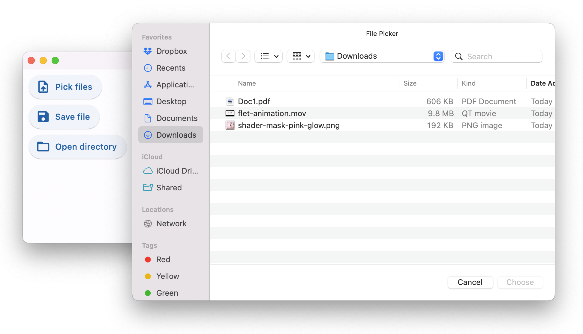
File picker allows opening three dialogs:

  • Pick files - one or multiple, any files or only specific types.
  • Save file - choose directory and file name.
  • Get directory - select directory.

When running Flet app in a browser only "Pick files" option is available and it's used for uploads only as it, obviously, doesn't return a full path to a selected file.

Where file picker really shines is a desktop! All three dialogs return full paths to selected files and directories - great assistance to your users!

Using file picker in your appโ€‹

It is recommended to add file picker to page.overlay.controls collection, so it doesn't affect the layout of your app. Despite file picker has 0x0 size it is still considered as a control when put into Row or Column.

import flet as ft

file_picker = ft.FilePicker()
page.overlay.append(file_picker)
page.update()

To open file picker dialog call one of the three methods:

  • pick_files()
  • save_file()
  • get_directory_path()

Lambda works pretty nice for that:

ft.ElevatedButton("Choose files...",
on_click=lambda _: file_picker.pick_files(allow_multiple=True))

When dialog is closed FilePicker.on_result event handler is called which event object has one of the following properties set:

  • files - "Pick files" dialog only, a list of selected files or None if dialog was cancelled.
  • path - "Save file" and "Get directory" dialogs, a full path to a file or directory or None if dialog was cancelled.
import flet as ft

def on_dialog_result(e: ft.FilePickerResultEvent):
print("Selected files:", e.files)
print("Selected file or directory:", e.path)

file_picker = ft.FilePicker(on_result=on_dialog_result)

The last result is always available in FilePicker.result property.

Check File picker control docs for all available dialog methods and their parameters.
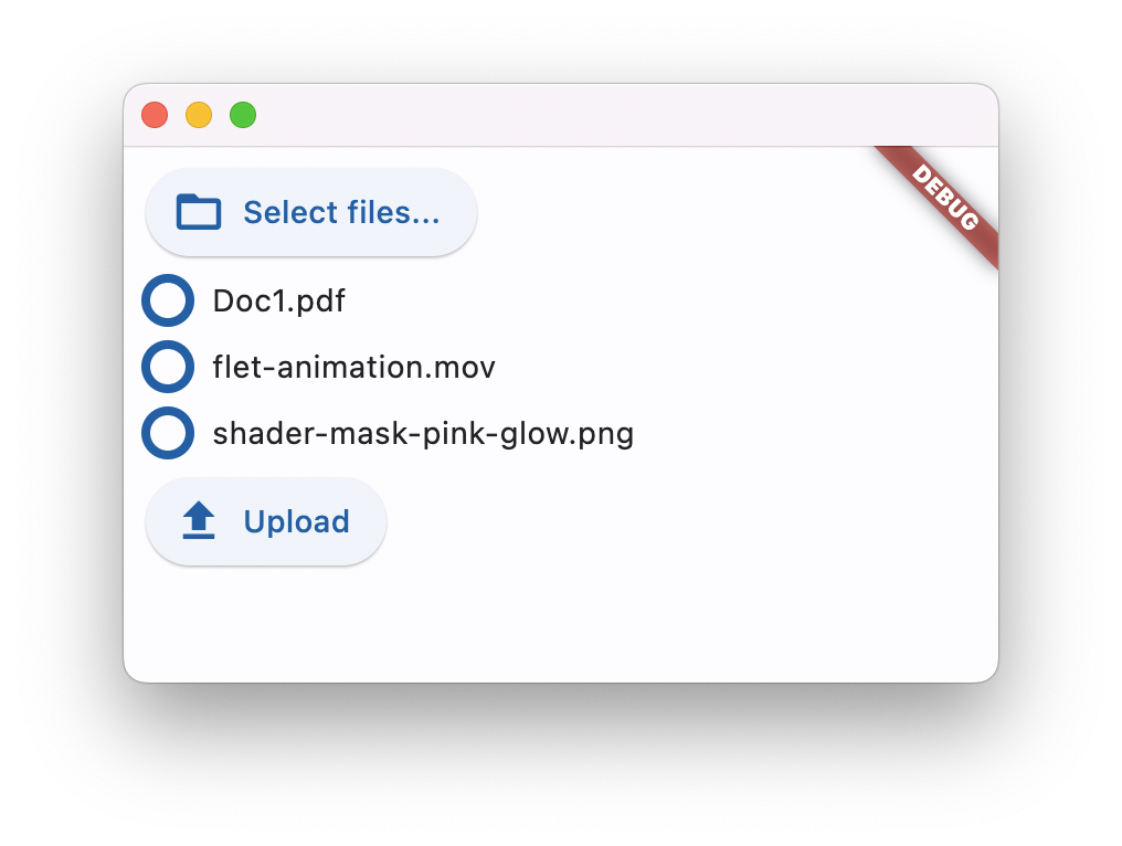
Uploading filesโ€‹

File picker has built-in upload capabilities that work on all platforms and the web.

To upload one or more files you should call FilePicker.pick_files() first. When the files are selected by the user they are not automatically uploaded anywhere, but instead their references are kept in the file picker state.

To perform an actual upload you should call FilePicker.upload() method and pass the list of files that need to be uploaded along with their upload URLs and upload method (PUT or POST):

import flet as ft

def upload_files(e):
upload_list = []
if file_picker.result != None and file_picker.result.files != None:
for f in file_picker.result.files:
upload_list.append(
FilePickerUploadFile(
f.name,
upload_url=page.get_upload_url(f.name, 600),
)
)
file_picker.upload(upload_list)

ft.ElevatedButton("Upload", on_click=upload_files)
note

If you need to separate uploads for each user you can specify a filename prepended with any number of directories in page.get_upload_url() call, for example:

upload_url = page.get_upload_url(f"/{username}/pictures/{f.name}", 600)

/{username}/pictures directories will be automatically created inside upload_dir if not exist.

Upload storageโ€‹

Notice the usage of page.get_upload_url() method - it generates a presigned upload URL for Flet's internal upload storage.

Use any storage for file uploads

You can generate presigned upload URL for AWS S3 storage using boto3 library.

The same technique should work for Wasabi, Backblaze, MinIO and any other storage providers with S3-compatible API.

To enable Flet saving uploaded files to a directory provide full or relative path to that directory in flet.app() call:

ft.app(target=main, upload_dir="uploads")

You can even put uploads inside "assets" directory, so uploaded files, e.g. pictures, docs or other media, can be accessed from a Flet client right away:

ft.app(target=main, assets_dir="assets", upload_dir="assets/uploads")

and somewhere in your app you can display uploaded picture with:

page.add(ft.Image(src="/uploads/<some-uploaded-picture.png>"))

Upload progressโ€‹

Once FilePicker.upload() method is called Flet client asynchronously starts uploading selected files one-by-one and reports the progress via FilePicker.on_upload callback.

Event object of on_upload event is an instance of FilePickerUploadEvent class with the following fields:

  • file_name
  • progress - a value from 0.0 to 1.0.
  • error

The callback is called at least twice for every uploaded file: with 0 progress before upload begins and with 1.0 progress when upload is finished. For files larger than 1 MB a progress is additionally reported for every 10% uploaded.

Check that example demonstrating multiple file uploads:

See File picker control docs for all its properties and examples.

Upgrade Flet module to the latest version (pip install flet --upgrade), give File Picker a try and let us know what you think!

Enjoy!

Fun with animations

ยท 2 min read
Feodor Fitsner
Flet founder and developer

Despite Flet release debuting animations support was released some time ago, we've just finished documenting its new features! We all know if the feature is not documented it just doesn't exist! ๐Ÿ˜‰

Flutter offers multiple approaches for creating animations such "implicit", "explicit", "tween", "stagered", "pre-canned" animations as well as displaying animation scenes prepared in Rive and Lottie editors.

We are starting with "implicit" animations which allows you to animate a control property by setting a target value; whenever that target value changes, the control animates the property from the old value to the new one.

Demo timeโ€‹

Explore demo sources. The demo is hosted on Heroku, by the way, so you can use it as a starting point for your own deployments.

Implicit animationsโ€‹

Implicit animations can be enabled for the following control properties:

Additionally, all Container control properties can be now animated and there is a new AnimatedSwitcher control for animated transition between old a new content.

Other new featuresโ€‹

Markdown controlโ€‹

Allows to render text in Markdown format. Supports various extensions: CommonMark, GitHub Web and GitHub Flavored.

See Markdown control docs for more information and examples.

URL launcherโ€‹

page.launch_url(url) method allows programmatically opening a URL in a new browser window, for example:

page.launch_url("https://google.com")

It also works nice with Markdown control for opening links within markdown document.

Keyboard shortcutsโ€‹

Page now contains on_keyboard_event event handlet to globally intercept all keystrokes.

Check this simple usage example.

Accessibility improvementsโ€‹

We added Accessibility section to the docs covering semantics support for screen readers.

ShaderMark controlโ€‹

A control that applies a mask generated by a shader to its content. Allows making nice effects like gradually fading out images.

That's it!

Give Flet a try and let us know what you think!

Beautiful gradients, button styles and TextField rounded corners in a new Flet release

ยท 4 min read
Feodor Fitsner
Flet founder and developer

We've just released Flet 0.1.46 adding new exciting features:

  • Gradient backgrounds in Container
  • Extensive styling for buttons, TextField and Dropdown controls
  • ...and more

Gradient backgroundsโ€‹

Linear gradientโ€‹

import math
import flet as ft

def main(page: ft.Page):

page.add(
ft.Container(
alignment=ft.alignment.center,
gradient=ft.LinearGradient(
begin=ft.alignment.top_left,
end=Alignment(0.8, 1),
colors=[
"0xff1f005c",
"0xff5b0060",
"0xff870160",
"0xffac255e",
"0xffca485c",
"0xffe16b5c",
"0xfff39060",
"0xffffb56b",
],
tile_mode=ft.GradientTileMode.MIRROR,
rotation=math.pi / 3,
),
width=150,
height=150,
border_radius=5,
)
)

ft.app(target=main)

Check LinearGradient docs for more information about LinearGradient properties.

Radial gradientโ€‹

import flet as ft

def main(page: ft.Page):

page.add(
ft.Container(
alignment=ft.alignment.center,
gradient=ft.RadialGradient(
center=Alignment(0.7, -0.6),
radius=0.2,
colors=[
"0xFFFFFF00", # yellow sun
"0xFF0099FF", # blue sky
],
stops=[0.4, 1.0],
),
width=150,
height=150,
border_radius=5,
)
)

ft.app(target=main)

Check RadialGradient docs for more information about RadialGradient properties.

Sweep gradientโ€‹

import math
import flet as ft

def main(page: ft.Page):

page.add(
ft.Container(
alignment=ft.alignment.center,
gradient=SweepGradient(
center=ft.alignment.center,
start_angle=0.0,
end_angle=math.pi * 2,
colors=[
"0xFF4285F4",
"0xFF34A853",
"0xFFFBBC05",
"0xFFEA4335",
"0xFF4285F4",
],
stops=[0.0, 0.25, 0.5, 0.75, 1.0],
),
width=150,
height=150,
border_radius=5,
)
)

ft.app(target=main)

Check SweepGradient docs for more information about SweepGradient properties.

Buttons stylingโ€‹

This Flet release introduces style property to all button controls which is an instance of ButtonStyle class. ButtonStyle allows controlling all visual aspects of a button, such as shape, foreground, background and shadow colors, content padding, border width and radius!

Moreover, each individual style attribute could be configured for a different "Material states" of a button, such as "hovered", "focused", "disabled" and others. For example, you can configure a different shape, background color for a hovered state and configure fallback values for all other states.

Check this "extreme" styling example:

import flet as ft
from flet.border import BorderSide
from flet.buttons import RoundedRectangleBorder

def main(page: ft.Page):

page.add(
ft.ElevatedButton(
"Styled button 1",
style=ft.ButtonStyle(
color={
ft.MaterialState.HOVERED: ft.colors.WHITE,
ft.MaterialState.FOCUSED: ft.colors.BLUE,
ft.MaterialState.DEFAULT: ft.colors.BLACK,
},
bgcolor={ft.MaterialState.FOCUSED: ft.colors.PINK_200, "": ft.colors.YELLOW},
padding={ft.MaterialState.HOVERED: 20},
overlay_color=ft.colors.TRANSPARENT,
elevation={"pressed": 0, "": 1},
animation_duration=500,
side={
ft.MaterialState.DEFAULT: BorderSide(1, ft.colors.BLUE),
ft.MaterialState.HOVERED: BorderSide(2, ft.colors.BLUE),
},
shape={
ft.MaterialState.HOVERED: RoundedRectangleBorder(radius=20),
ft.MaterialState.DEFAULT: RoundedRectangleBorder(radius=2),
},
),
)
)

ft.app(target=main)

ft.MaterialState.DEFAULT state is a fallback style.

Button shape could also be changed with ButtonStyle.shape property:

import flet as ft
from flet.buttons import (
BeveledRectangleBorder,
CircleBorder,
ContinuousRectangleBorder,
RoundedRectangleBorder,
StadiumBorder,
)

def main(page: ft.Page):
page.padding = 30
page.spacing = 30
page.add(
ft.FilledButton(
"Stadium",
style=ft.ButtonStyle(
shape=ft.StadiumBorder(),
),
),
ft.FilledButton(
"Rounded rectangle",
style=ft.ButtonStyle(
shape=ft.RoundedRectangleBorder(radius=10),
),
),
ft.FilledButton(
"Continuous rectangle",
style=ft.ButtonStyle(
shape=ft.ContinuousRectangleBorder(radius=30),
),
),
ft.FilledButton(
"Beveled rectangle",
style=ft.ButtonStyle(
shape=ft.BeveledRectangleBorder(radius=10),
),
),
ft.FilledButton(
"Circle",
style=ft.ButtonStyle(shape=ft.CircleBorder(), padding=30),
),
)

ft.app(target=main)

Check ElevatedButton.style property docs for a complete description of ButtonStyle class and its properties.

TextField and Dropdown stylingโ€‹

It is now possible to configure text size, border style and corners radius for normal and focused states of TextField and Dropdown controls. TextField also allows configuring colors for a cursor and selection.

Additionally, the maximum length of entered into TextField can now be limited with max_length property.

We also introduced capitalization property for automatic capitalization of characters as you type them into TextField. You can choose from 4 capitalization strategies: none (default), characters, words and sentences.

An example of styled TextField with max_length and capitalization:

import flet as ft

def main(page: ft.Page):
page.padding = 50
page.add(
ft.TextField(
text_size=30,
cursor_color=ft.colors.RED,
selection_color=ft.colors.YELLOW,
color=ft.colors.PINK,
bgcolor=ft.colors.BLACK26,
filled=True,
focused_color=ft.colors.GREEN,
focused_bgcolor=ft.colors.CYAN_200,
border_radius=30,
border_color=ft.colors.GREEN_800,
focused_border_color=ft.colors.GREEN_ACCENT_400,
max_length=20,
capitalization="characters",
)
)

ft.app(target=main)

An example of styled Dropdown control:

import flet as ft

def main(page: ft.Page):
page.padding = 50
page.add(
ft.Dropdown(
options=[
ft.dropdown.Option("a", "Item A"),
ft.dropdown.Option("b", "Item B"),
ft.dropdown.Option("c", "Item C"),
],
border_radius=30,
filled=True,
border_color=ft.colors.TRANSPARENT,
bgcolor=ft.colors.BLACK12,
focused_bgcolor=ft.colors.BLUE_100,
)
)

ft.app(target=main)

Other changesโ€‹

IconButton got selected state which plays nice with a new style.

This is an example of a toggle icon button:

import flet as ft

def main(page: ft.Page):

def toggle_icon_button(e):
e.control.selected = not e.control.selected
e.control.update()

page.add(
ft.IconButton(
icon=ft.icons.BATTERY_1_BAR,
selected_icon=ft.icons.BATTERY_FULL,
on_click=toggle_icon_button,
selected=False,
style=ft.ButtonStyle(color={"selected": ft.colors.GREEN, "": ft.colors.RED}),
)
)

ft.app(target=main)

Give Flet a try and let us know what you think!

Control Refs

ยท 3 min read
Feodor Fitsner
Flet founder and developer

Flet controls are objects and to access their properties we need to keep references (variables) to those objects.

Consider the following example:

import flet as ft

def main(page):

first_name = ft.TextField(label="First name", autofocus=True)
last_name = ft.TextField(label="Last name")
greetings = ft.Column()

def btn_click(e):
greetings.controls.append(ft.Text(f"Hello, {first_name.value} {last_name.value}!"))
first_name.value = ""
last_name.value = ""
page.update()
first_name.focus()

page.add(
first_name,
last_name,
ft.ElevatedButton("Say hello!", on_click=btn_click),
greetings,
)

ft.app(target=main)

In the very beginning of main() method we create three controls which we are going to use in button's on_click handler: two TextField for first and last names and a Column - container for greeting messages. We create controls with all their properties set and in the end of main() method, in page.add() call, we use their references (variables).

When more and mode controls and event handlers added it becomes challenging to keep all control definitions in one place, so they become scattered across main() body. Glancing at page.add() parameters it's hard to imagine (without constant jumping to variable definitions in IDE) what would the end form look like:

    page.add(
first_name,
last_name,
ft.ElevatedButton("Say hello!", on_click=btn_click),
greetings,
)

Is first_name a TextField, does it have autofocus set? Is greetings a Row or a Column?

Ref classโ€‹

Flet provides Ref utility class which allows to define a reference to the control, use that reference in event handlers and set the reference to a real control later, while building a tree. The idea comes from React.

To define a new typed control reference:

first_name = ft.Ref[ft.TextField]()

To access referenced control (control de-reference) use Ref.current property:

# empty first name
first_name.current.value = ""

To assign control to a reference set Control.ref property to a reference:

page.add(
ft.TextField(ref=first_name, label="First name", autofocus=True)
)
note

All Flet controls have ref property.

We could re-write our program to use references:

import flet as ft


def main(page):

first_name = ft.Ref[ft.TextField]()
last_name = ft.Ref[ft.TextField]()
greetings = ft.Ref[ft.Column]()

def btn_click(e):
greetings.current.controls.append(
ft.Text(f"Hello, {first_name.current.value} {last_name.current.value}!")
)
first_name.current.value = ""
last_name.current.value = ""
page.update()
first_name.current.focus()

page.add(
ft.TextField(ref=first_name, label="First name", autofocus=True),
ft.TextField(ref=last_name, label="Last name"),
ft.ElevatedButton("Say hello!", on_click=btn_click),
ft.Column(ref=greetings),
)

ft.app(target=main)

Now we can clearly see in page.add() the structure of the page and all the controls it's built of.

Yes, the logic becomes a little bit more verbose as you need to add .current. to access ref's control, but it's a matter of personal preference :)

Give Flet a try and let us know what you think!

Flet Mobile Strategy

ยท 4 min read
Feodor Fitsner
Flet founder and developer

Flet project has received a lot of attention recently and we would like to thank all the developers who tried Flet and have been spreading the word about it in the communities! Your support motivates us to move Flet project forward with faster pace!

New Flet developers are constantly asking if there is a way to package Flet program to an .apk file to deploy to Android devices or .ipa to deploy to iOS.

In this post I would like to share our vision for Flet going mobile and provide a roadmap.

Server-Driven UIโ€‹

Flet is a Server-driven UI (SDUI) framework. SDUI is an emerging technology which is the best described in Technology Radar post:

Server-driven UI separates the rendering into a generic container in the mobile app while the structure and data for each view is provided by the server. This means that changes that once required a round trip to an app store can now be accomplished via simple changes to the responses the server sends.

Companies like DoorDash, Airbnb, Lyft and others have been successfully implementing Server-driven UI in their mobile apps to reduce time-to-market.

Flet approachโ€‹

Flet is going to implement Server-Driven UI approach where program written in Python or other language is running on the server and only a thin client - either standalone Flutter app (.apk or .ipa package) in app store or a Flutter widget as a part of another app - is delivered to a mobile:

Once SDUI experience is ready we'll start working on a standalone mobile package.

Roadmapโ€‹

To provide the best experience for Flet apps on mobile platforms, we plan to release the following items by the end of this year:

Flet widget for Flutterโ€‹

The first step we are going to do is to separate Flet client into a Flutter widget and publish the package at https://pub.dev. Flet widget could be then integrated by mobile developers into existing or new Flutter apps for adding dynamic server-driven UI experiences to the core app functionality. A new Flutter app could be also created with a single Flet widget just for the purpose of hosting a complete Flet app.

Developers will follow Flutter guide for packaging, signing and distributing their apps to Android, iOS, Linux, macOS or Windows platforms.

Flet team will provide sample CI pipelines to automate packaging, signing and publishing of Flutter apps.

Flet Studio for iOS and Androidโ€‹

The next step is a standalone "Flet Studio" app (the name is not final) in App Store and Google Play for "testing mobile experiences developed with Flet framework". Developers or beta testers will be able to "register" URL of their hosted Flet app within Flet Studio and instantly see how it performs on a mobile device.

White-labeled Flet mobile appโ€‹

We are going to provide a guide and CI pipeline for automatic publishing of white-labeled Flet app to a user App Store or Google Play account. This app will be "pinned" to a specific app URL and could additionally bundle app assets (media, fonts) to minimize network usage.

Standalone mobile package for Flet appโ€‹

We are going to investigate the way and develop a prototype for bundling together Flet framework, user program, language runtime and all dependencies into a standalone mobile package (.apk or .ipa package), so Flet program does not require a web server.

Embedding Flet into native appsโ€‹

We are going to provide a guide, sample apps and CI pipeline to integrate Flet widget into existing native Android and iOS apps (not developed with Flutter) using Flutter Add-to-App feature. Put Flutter to work article gives a real-world example on how to integrate Flutter into existing mobile app.

This is the current plan.

In the meantime, give Flet a try and let us know what you think!